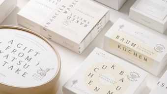
Graphic art direction example for Chateraise “Yatsudoki”

World Space Solutions Co., Ltd. of the World Group is responsible for creative direction such as the brand name and shop image of the urban sweets brand “YATSUDOKI” launched by Chateraise Co., Ltd. in the fall of 2019, logo design, art direction such as shop application tools. I worked on
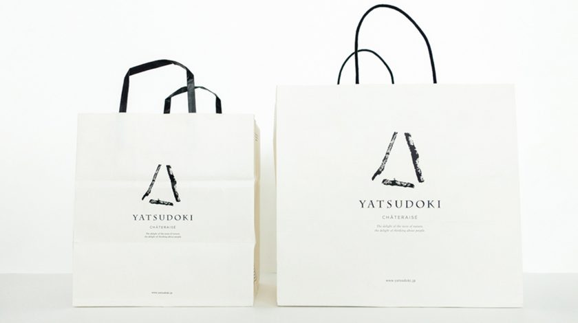
The brand name "YATSUDOKI" is a symbol of Yamanashi Prefecture, where Chateraise Co., Ltd. was founded. "Yatsukoku", which is a way of counting, means "3 o'clock in the afternoon", and it has the meaning of "snack time". The branches that make up the triangular shape of the brand logo are actually picked up in Yatsugatake.
The shop application tool expresses the client's commitment to "materials" and "quality" that are important in making sweets with a logo mark with a stamp-like expression and monotone colors. It has an impressive, simple and clean design.
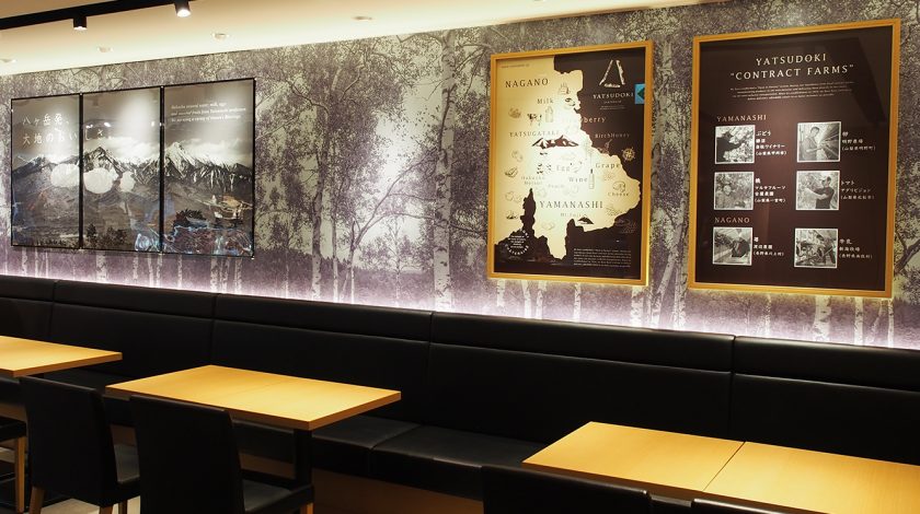
At the store, we created a graphic design and space that incorporates a message that allows you to feel more familiar with the products and Yamanashi and Yatsugatake.
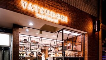
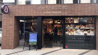
You can also see examples of YATSUDOKI stores from RELATED LINKS at the bottom of the page.