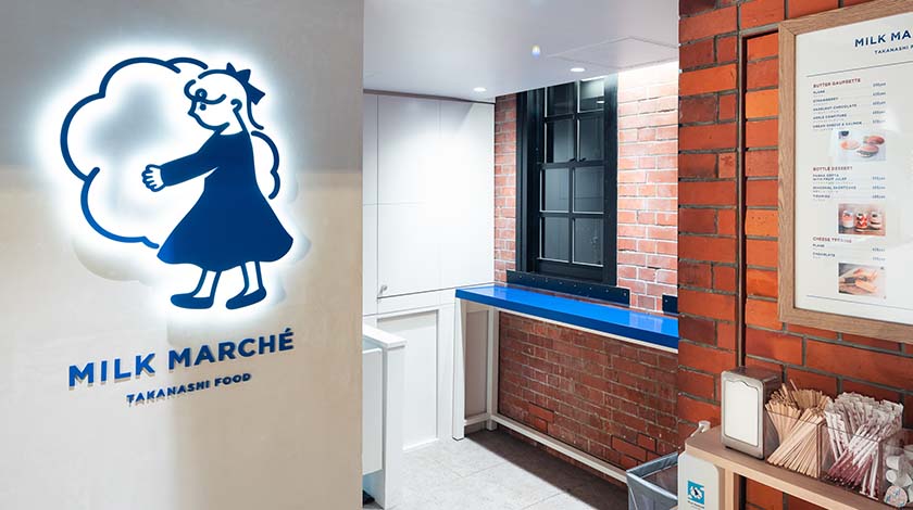


“MILK MARCHÉ” Yokohama Red Brick Warehouse Branding Example

Comprehensive production of the world view of the “MILK MARCHÉ” brand
The brand concept and naming of "MILK MARCHÉ" operated by Takanashi Food Co., Ltd. (Takanashi Dairy Products Co., Ltd. Group), logos, marks, store interior design, signs, menus and other promotional items. The creative tools for expression were comprehensively produced by the World Platform Service Co., Ltd. space design and store design team.
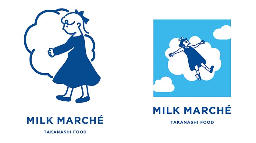
The concept is "CLEAR POP MILK"
The concept of the new store is "CLEAR POP MILK", which is based on the image of "the fun of gathering under the blue sky and enjoying delicious milk", against the background of opening in the "Yokohama Red Brick Warehouse".
Based on this concept, we named it "MILK MARCHÉ" as a place where you can enjoy the time to choose and taste menus using milk.
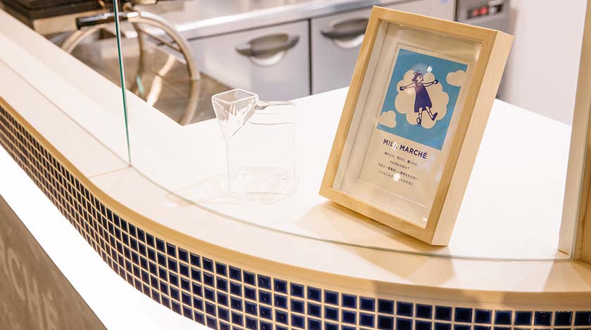
In addition, the illustration of the girl placed in various places in the store is an image of a fairy working in the kitchen above the clouds, and it is also used as the logo mark.
"CLEAR = Clear and clear blue sky"
"POP = Lively"
"MILK = white clouds floating in the clear sky"
Discover and experience the deliciousness of milk
The interior of the store is based on white, giving it a simple and high-quality impression. In addition, the glass-enclosed live kitchen where you can observe the process of making products is designed to help customers have an enjoyable experience.
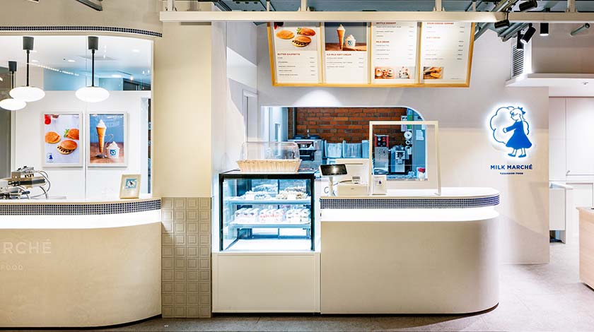
logo mark design
Inspired by the concept of "CLEAR POP MILK", we designed the naming, logo and mark.